Painting Flavor with Artist Katie Clark Gabbard
By David Nilsen
“With beer and chocolate, they’re about so much more than just creating something that tastes good. There’s a story that’s trying to be told if you just take the time to try to go on that journey and listen to what your senses are telling you.”
Katie Clark Gabbard is a professional artist working in Dayton, Ohio, creating vividly colorful paintings in unexpected formats, using the very shape and texture of each piece to challenge perceptions within the sometimes staid fine art world. Katie and I recently convened in her bright and airy studio inside the Front Street Artists art community one morning to see what might come of the idea that flavor could directly inspire art.
I brought along several chocolates and beers to Katie’s studio, and gave each to her to taste, one at a time. She would then spend ten to fifteen minutes painting a small canvas, expressing in colors and shapes the flavors she experienced and the images they conjured. Only after she finished each would I reveal what she had just tasted. We were both fascinated by the results.
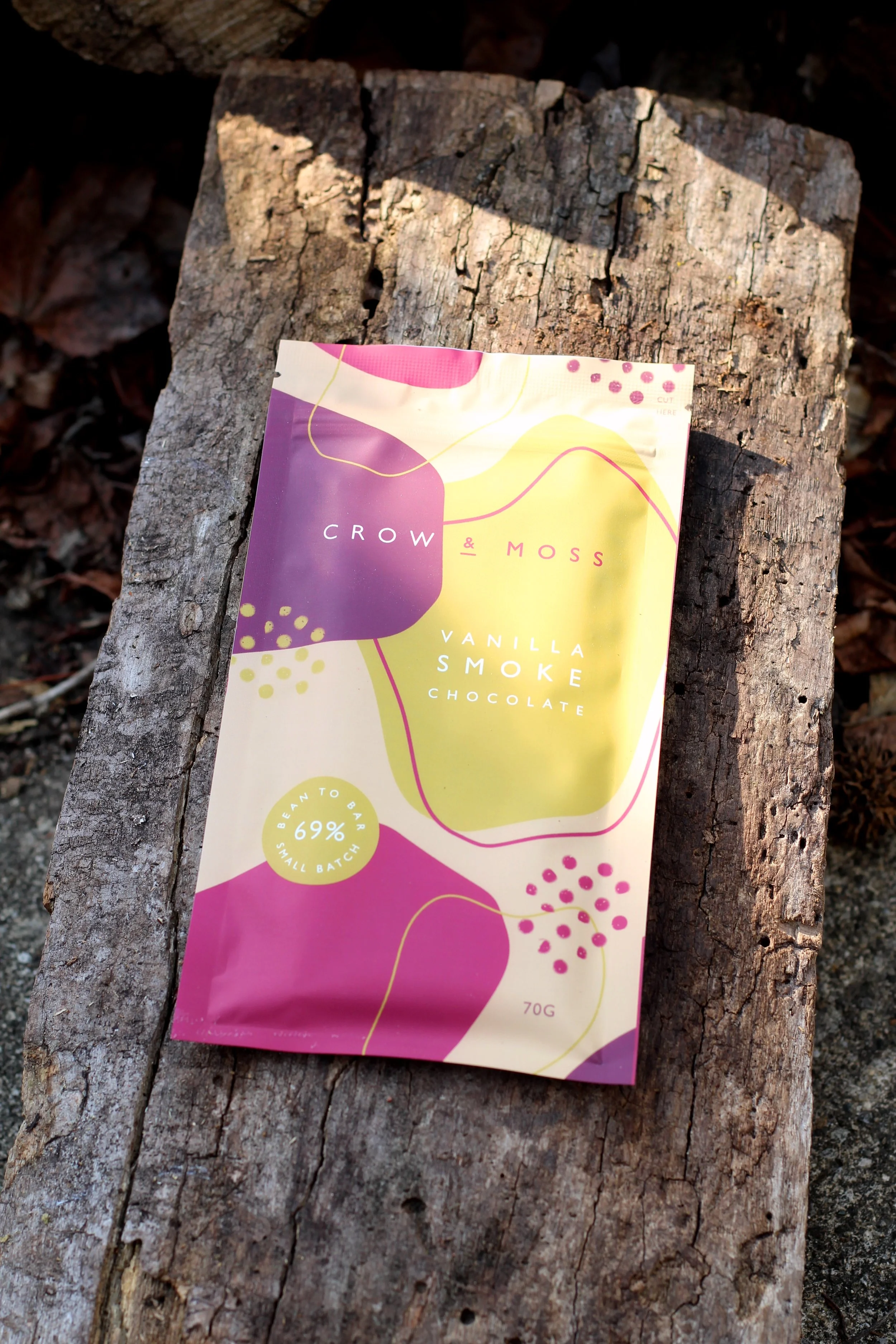
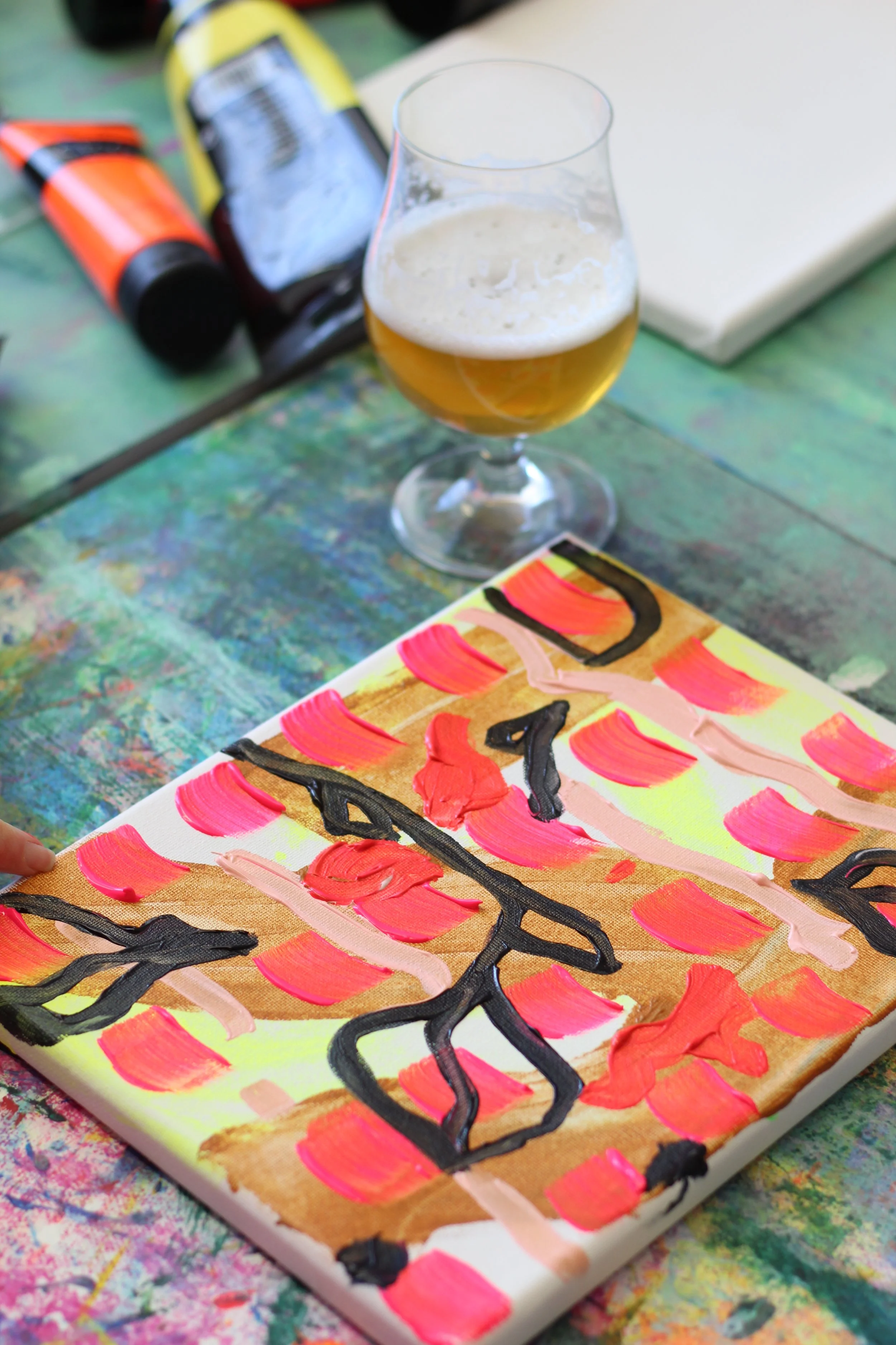
The first chocolate I give Katie to taste is Crow & Moss Vanilla Smoke, a 69% dark chocolate bar made with Madagascar vanilla, cacao smoked over hickory, and a touch of salt. You might remember this bar from back in Episode 19, when my friend Shay Pal of the @choccoffeewine Instagram account and I tasted through this bar and discussed its nostalgic, evocative flavors.
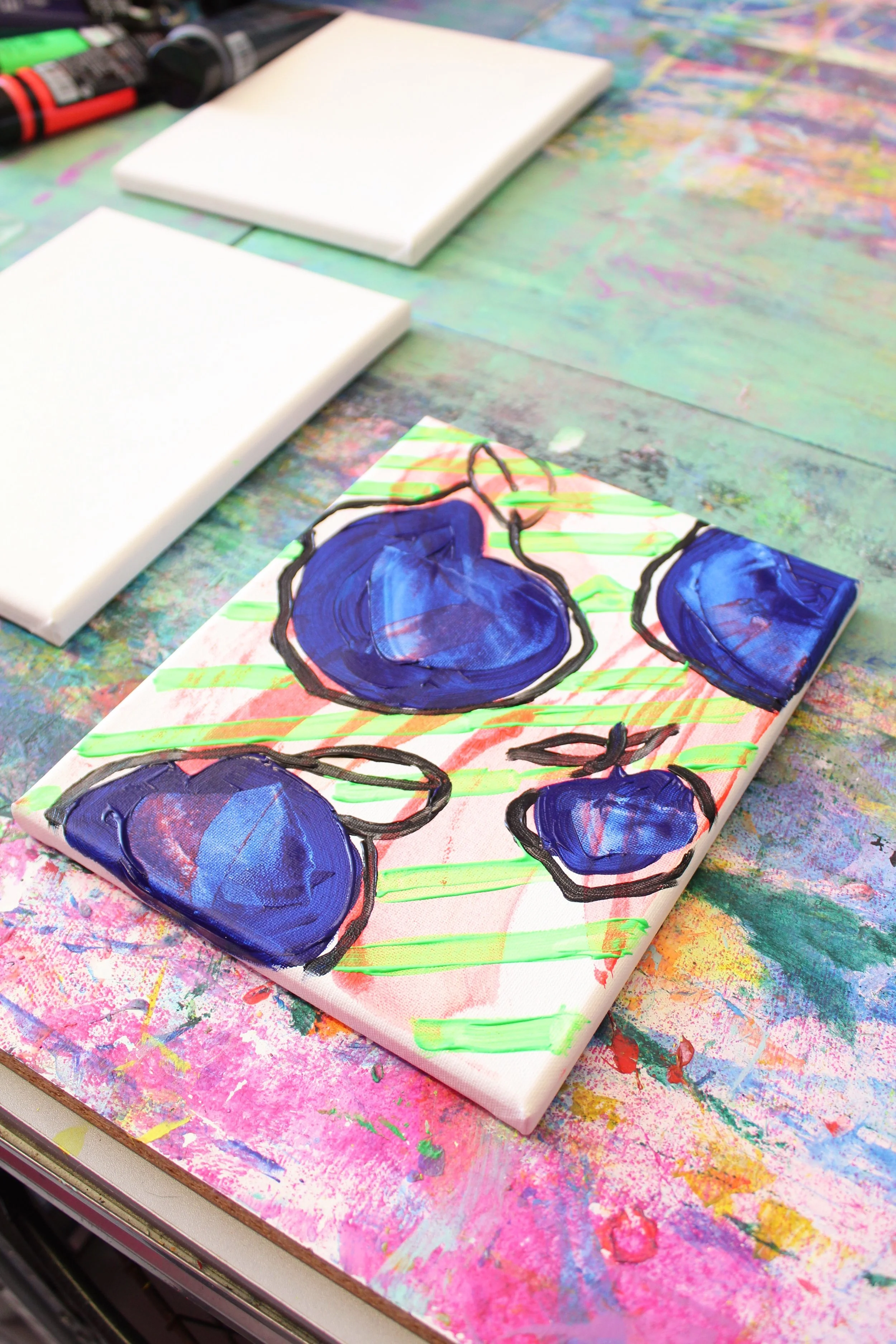
Katie began mixing her paints on her palette, and made sweeping, uneven streaks on the canvas with the orange over the next couple minutes, laying it down with a rubber, brush-shaped squeegee rather than a traditional brush.
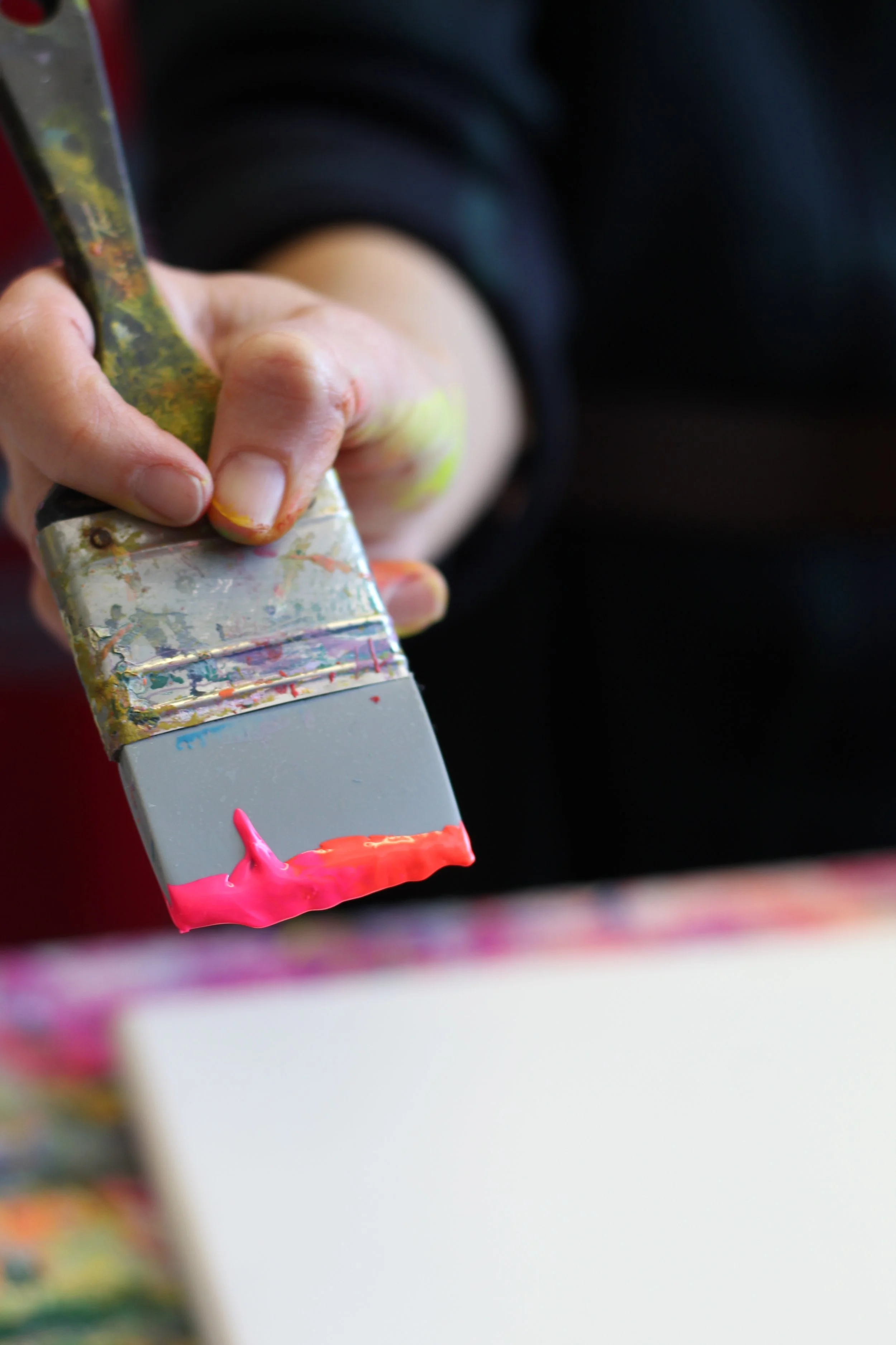
Next she added a striking dark blue purple to her canvas in round, fruit-like shapes, and once several adorned the surface, she interlaced them with diagonal stripes of fluorescent green. She explained that much of her paintings process is about balancing, each step counteracting the last one, to continually fill in and offset her choices until she has a cohesive finished piece.
Streaked across the surface was the bright green that represents earthiness to Katie, and behind that, the orange foundation strokes. Around the plums were the stark, black outlines that provided solidity and, in her words, harshness to the piece. Fruitiness, earthiness, citrus…a balance of brightness and darkness.
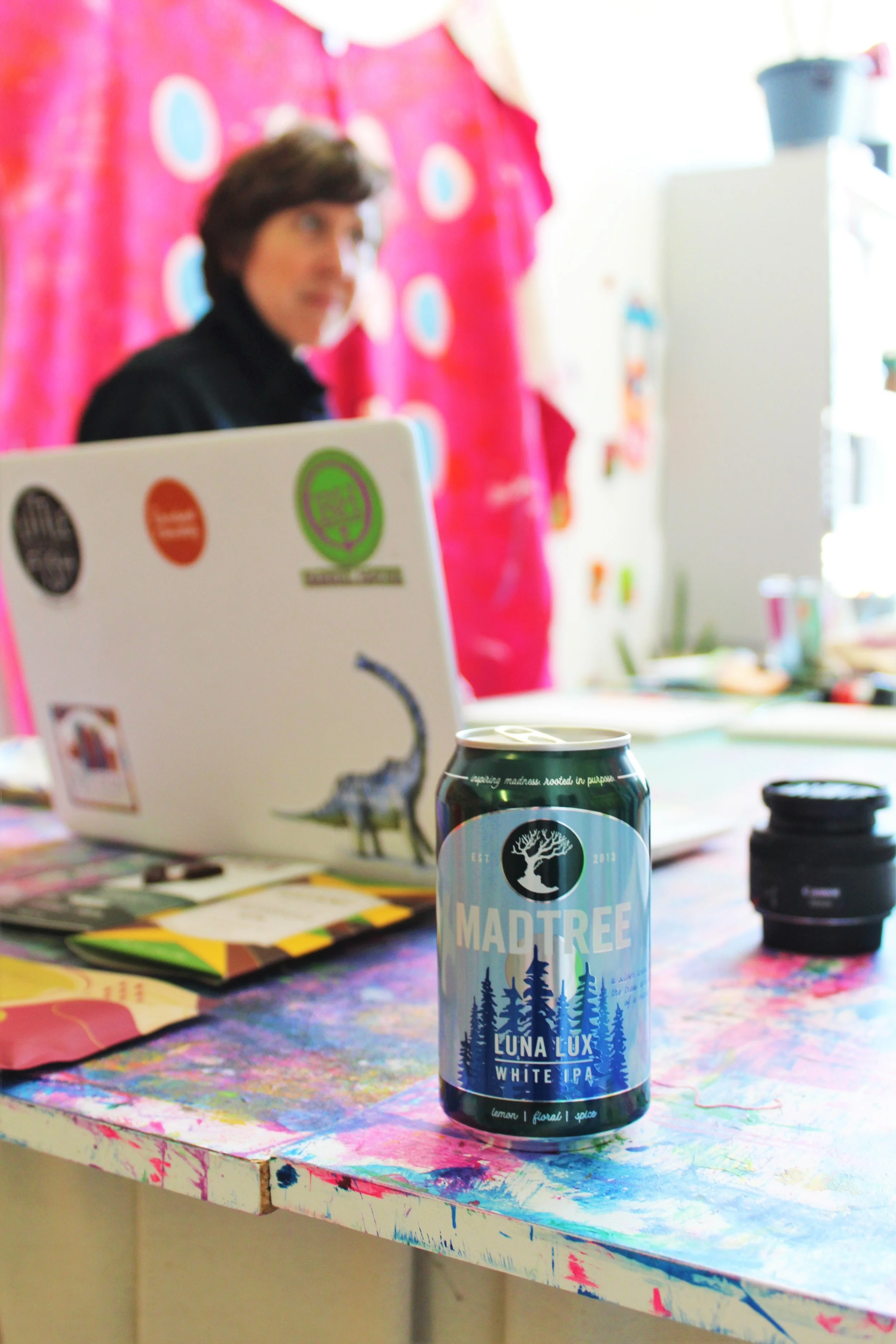
The first beer I gave Katie to taste was Luna Lux, a white IPA from Cincinnati’s MadTree Brewing. Luna Lux is brewed with coriander and lemon peel, along with Loral and Citra hops, which together create lemon, floral, and tropical notes. It’s a beautiful beer in a style brewed far too rarely, and it’s released each year as a winter seasonal. The can art features a moon rising behind evergreen trees, all of it cast in silvers and twilight blues. The flavors, though, are bright and sunny.
Katie put down a watery layer of bright yellow, with broad swerves of latte brown with a touch of a mustard tone to it. Across these ran thin soft pinkish ribbons, and over it all was a grid of brighter pink brush strokes. Finally, on this bright but cohesive background, she used a thin brush to put down the black outline of branches and leaves, once again introducing a harsher element to the sunny disposition of the rest of the painting.
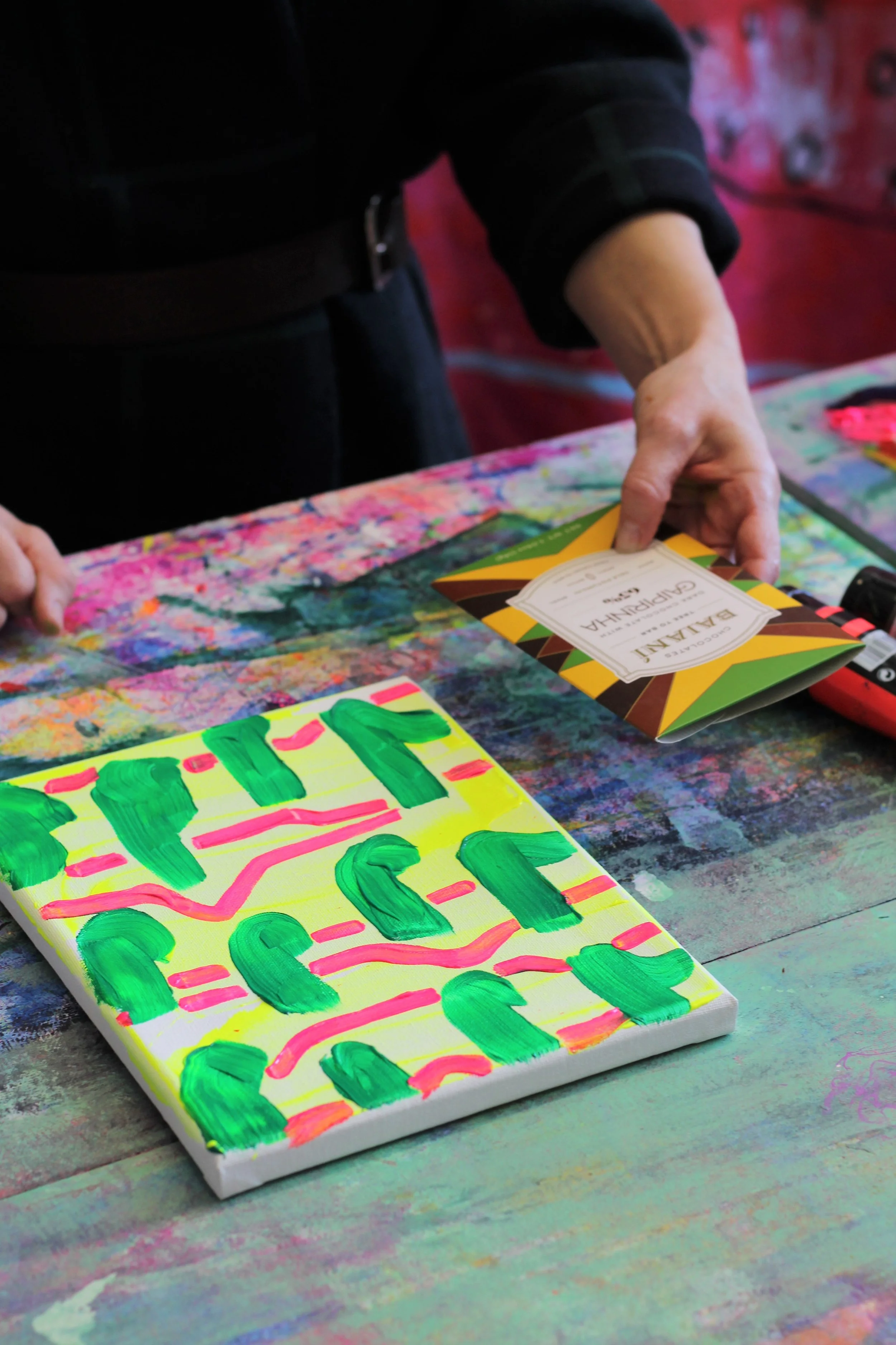
The next chocolate I gave Katie was Baiani Caipirinha, a 65% dark chocolate from Brazil made with Cachaca, a grassy sugarcane spirit similar to rum, and dried lime peel. It’s a fascinating bar and one of my favorites from the last year, with notes of chamomile, cat nip, light lemon drop, and grassy rum, and a hint of lime. Katie began painting immediately. She once again started with a foundation of fluorescent yellow before adding shapes on top of it—bright pink horizontal lines that speak to hills and contours, and green sprigs to evoke plant life. She said the bar brought to mind alfalfa hay from her parents’ farm where she grew up.
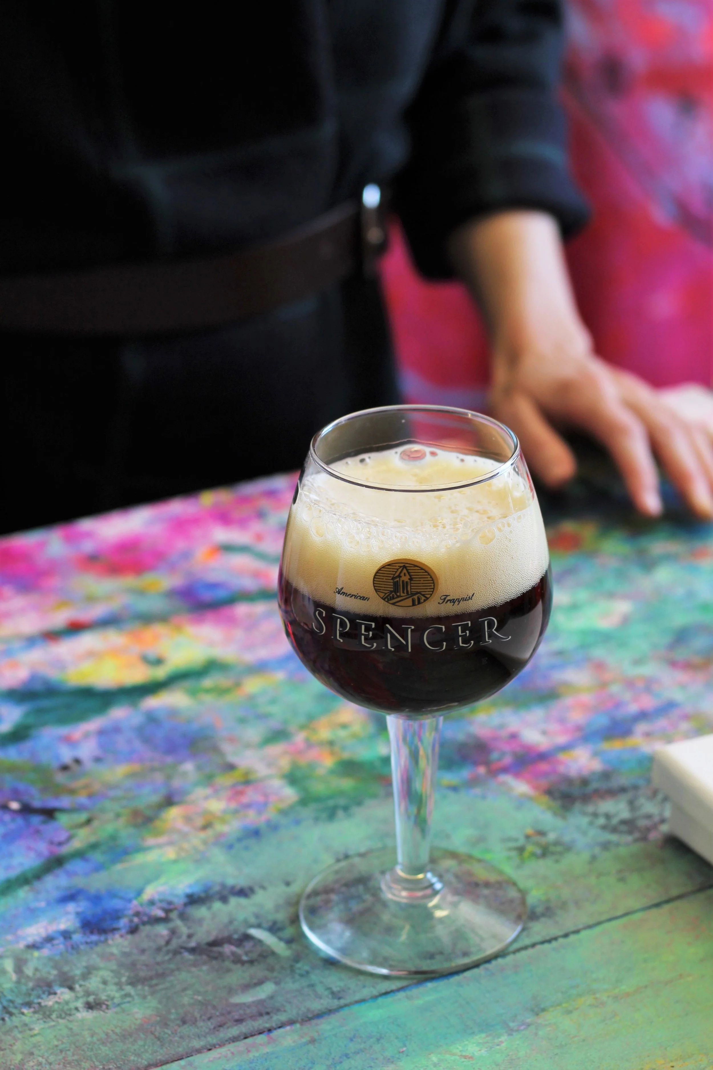
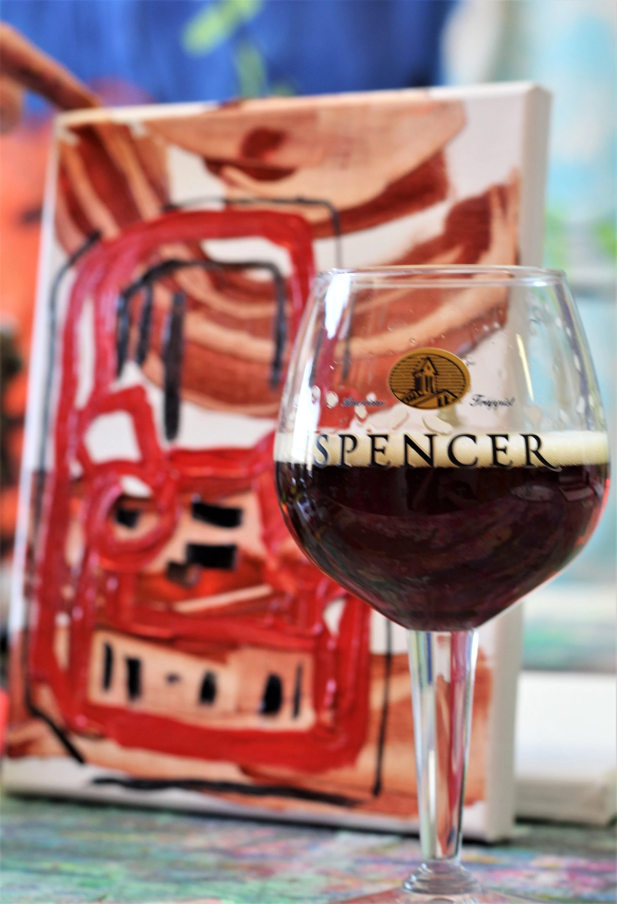
The last beer I had Katie try was Spencer Trappist Holiday Ale, a 9% ABV Christmas beer brewed by the brothers at St. Joseph’s Abbey in Spencer, Massachusetts. The beer is lightly spiced, though Spencer doesn’t reveal what spices they use, and features flavors of pome fruits, dark bread crust, baking spices, and whatever else you might tease out from the depths of such a strong and complex beer.
This was, in some ways, the most literal and the most abstract of Katie’s paintings during the entire session. Against a leathery, soft brown background, she painted what emerged as an overstuffed, worn-in red armchair.
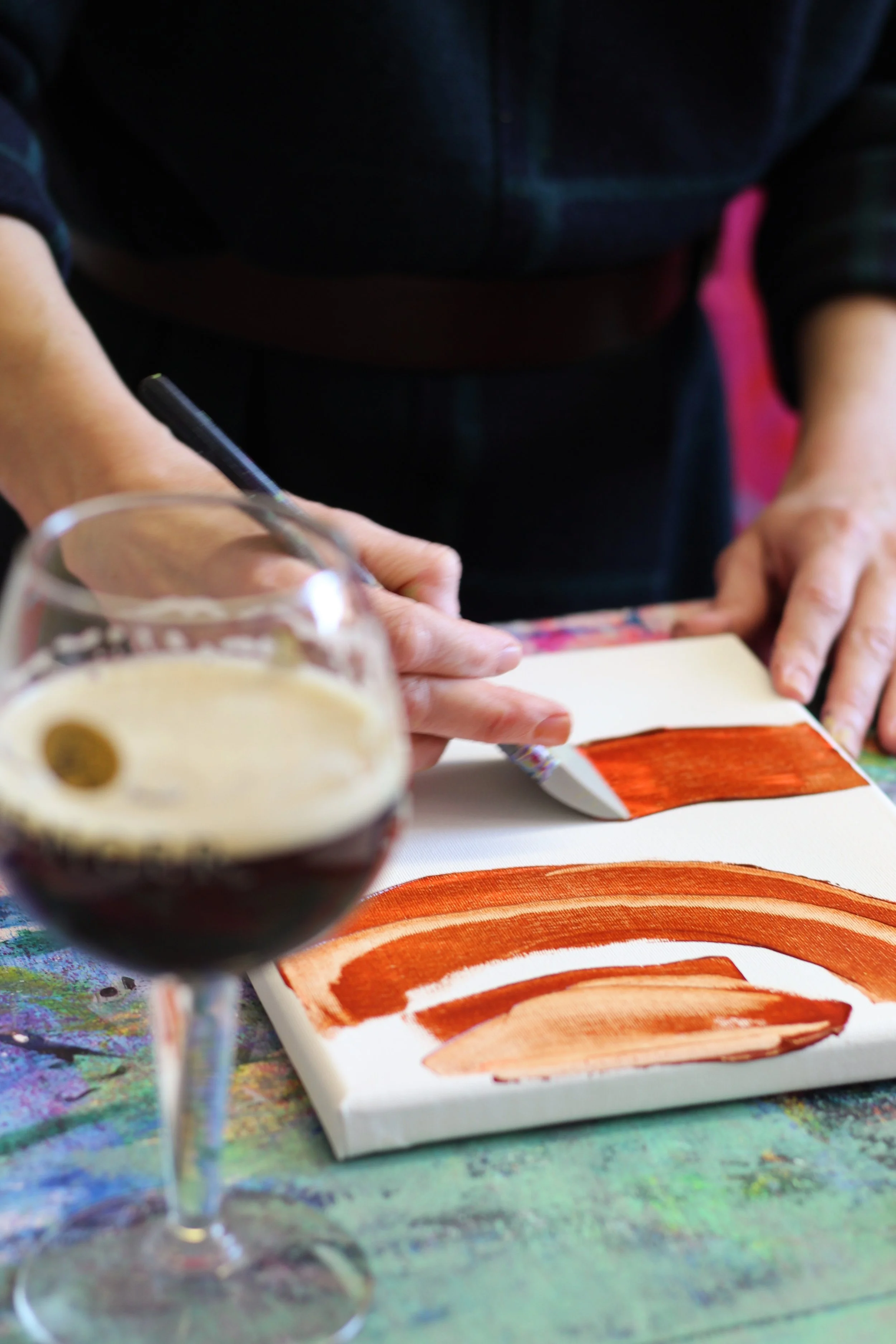
It’s the only painting she did that featured a notable degree of realism in its depiction, but also the only one that didn’t directly speak to the flavor of what she was tasting as much as the setting in which she’d like to enjoy it. She perfectly captured the feeling of the beer, and now I want nothing more than to sink into that chair in a lowlit room with books lining the walls, and sip on this beer while enjoying conversation with people I like.
The final chocolate I gave Katie to taste was the simplest of the three, at least in concept—a single origin bar with no bells and whistles—Loon Chocolate’s Heirloon Bolivia 70% dark chocolate. Back in Episode 22 I interviewed Loon founder and chocolate maker Scott Watson, so after you can check that out to learn more about the spirit behind this excellent maker. I broke off a piece and gave it to Katie, and the result of this round of our experiment was the most startling of all to both of us.

Katie put down diagonal blotches of rich yellow, with warmer, deeper red accents throughout. Inchoate shapes of the burnt umber, a greyish brown, were laid on top of this, which were then outlined in a cobalt blue. There’s no direct visual references here to anything literal, these colors and patterns just represent the feelings and impressions the chocolate gave her.
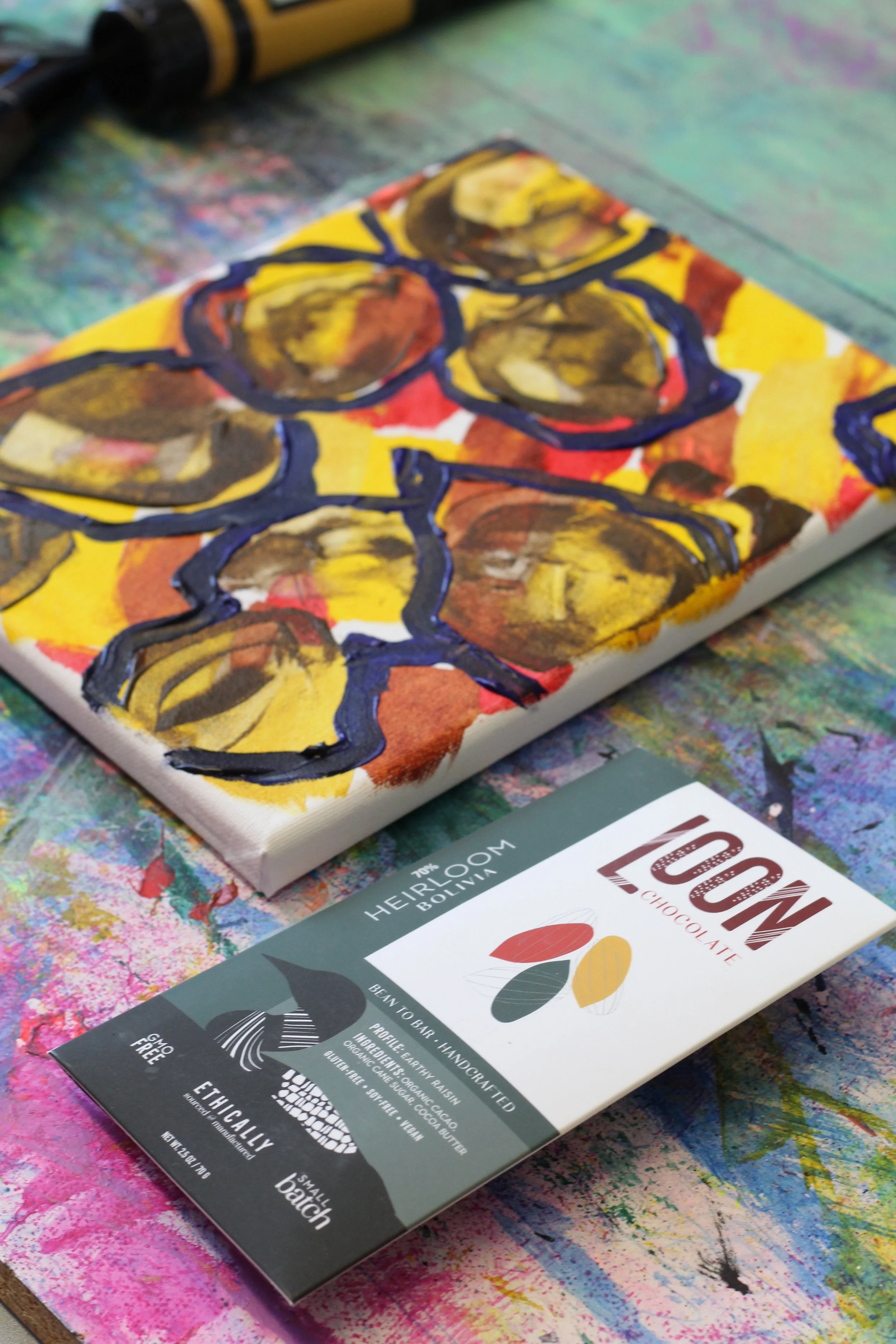
It’s important to know that not only did Katie not know what these chocolates and beers were, she also didn’t see the packaging before completing each painting. That’s especially noteworthy in this case, as the symmetry between Katie’s finished painting and the packaging for Loon’s Heirloom Bolivia bar gave us both a tingle up the back of our necks. The colors—all of them—were either perfect matches or close harmonies to each other.

Whether Katie’s paintings matched the packaging of any of these beers or chocolates or not isn’t right or wrong. Her impression of the MadTree beer with bright, sunny colors that were diametrically opposite of the brewer’s visual representation was just as valid as her close match on the Loon chocolate. Harmony between these was never the point. But seeing her visual representation of how these flavors struck her mind, senses, and emotions come so close to how those same flavors were interpreted by the maker nine hundred miles away, made with cacao from several thousand miles away, was staggering nonetheless.
You can find out more about Katie’s work at katieclarkgabbard.com, and follow her on Instagram at Katie_clark_gabbard.
You can listen to my full interview with Katie in Episode 36 of Bean to Barstool!